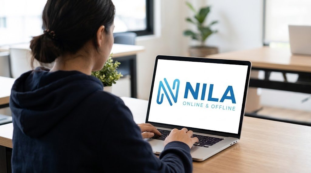
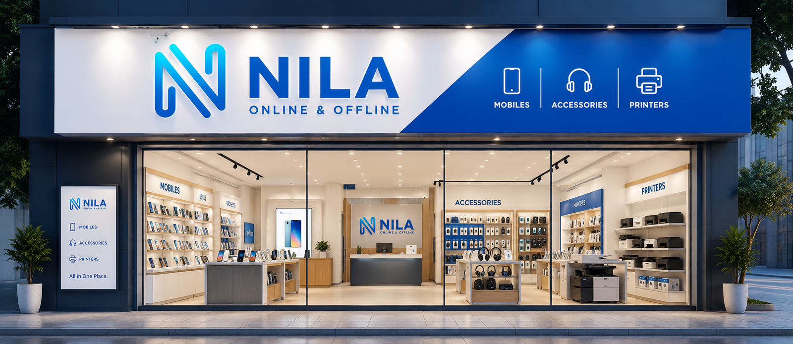
McGraphics, we believe a logo is more than just a symbol—it’s the face of a brand. For Nila, we created a logo that reflects simplicity, elegance, and a deep emotional connection with its audience.
Our goal was to design a logo that captures the essence of “Nila”—a name often associated with the moon, calmness, and beauty. The final design balances modern aesthetics with a timeless feel.
Logo Design That Speaks Your Brand
Design Concept
The concept behind the Nila logo was inspired by:
Minimalism – Clean and simple design for versatile usage
Elegance – Soft curves and refined typography
Symbolism – Subtle visual elements inspired by the moon (Nila)
Brand Recall – Easy-to-recognize and memorable structure
We focused on creating a logo that works seamlessly across digital and print platforms, ensuring strong brand recognition.
Our Approach
01. Research & Understanding
We studied the brand’s vision, target audience, and industry trends.
02. Concept Development
Multiple creative directions were explored before finalizing the concept.
03. Typography & Color Selection
Carefully chosen fonts and colors to reflect sophistication and calmness.
04. Refinement & Finalization
Polished the design to ensure clarity, balance, and scalability.
Key Features of the Logo
Modern and minimalist design
Scalable for all formats (website, social media, print)
Unique identity tailored to the brand
Balanced typography with symbolic inspiration
Timeless and versatile look
Tools & Expertise
Our team used industry-standard tools like:
Adobe Illustrator
Adobe Photoshop
Combined with creative expertise and branding strategy to deliver a high-quality result.
Outcome
The final Nila logo stands as a strong visual identity—simple yet meaningful, modern yet timeless. It enhances brand recognition and creates a lasting impression across all platforms.