Nexa Holidays
- Home
- portfolio
- Logo Design
- Nexa Holidays
Nexa Holidays Logo Design Project
Crafting a Brand Identity That Speaks Elegance & Meaning
MC Graphics developed a modern and memorable visual identity for Nexa Holidays, a travel company dedicated to creating seamless holiday experiences. The goal was to design a logo that communicates trust, adventure, and exploration while maintaining a clean, premium, and versatile brand image.
Project Overview
Client: Nexa Holidays
Industry: Travel & Tourism
Service: Logo Design & Brand Identity
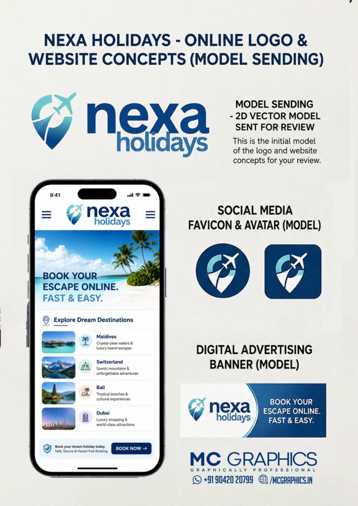
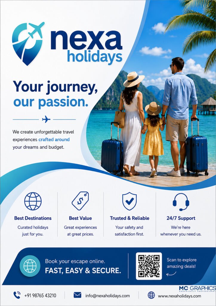
The branding was further extended into digital applications, including website concepts, social media assets, promotional banners, and marketing materials to ensure a consistent brand presence across all platforms.
HOW IT BENEFITS TRUSTING MC GRAPHICS
A professionally designed logo is the foundation of every successful travel brand. For Nexa Holidays, we created a distinctive identity that enhances brand recognition, builds customer trust, and delivers a consistent visual experience across websites, social media, digital campaigns, and print materials. The result is a memorable brand that stands out in the competitive travel industry.
01 STRONG BRAND RECOGNITION
Create a memorable identity with a unique logo that helps customers instantly recognize and remember the Nexa Holidays brand.
02 PROFESSIONAL BRAND IMAGE
A modern and clean visual identity builds trust, credibility, and confidence, making the business more appealing to potential travelers.
03 VERSATILE ACROSS PLATFORMS
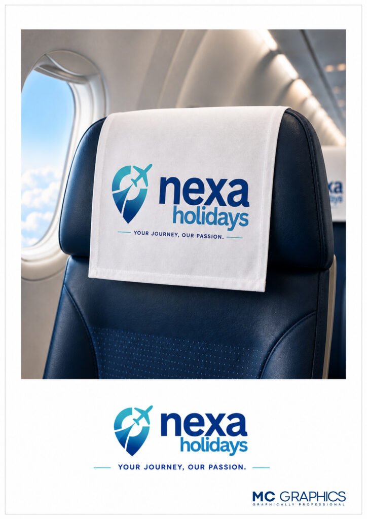
The logo is designed for seamless use across websites, mobile applications, social media, advertising materials, business stationery, and promotional merchandise.
04 CONSISTENT BRAND EXPERIENCE
A unified visual identity ensures every customer touchpoint reflects the same professional image, strengthening brand loyalty and market presence.
Design Concept
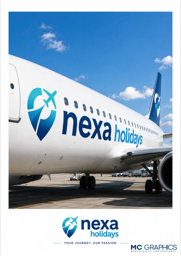
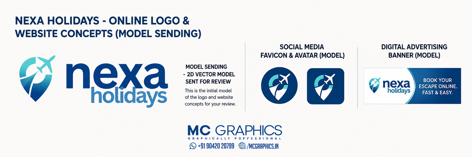
The logo combines a location pin with an airplane, symbolizing destinations, travel, and unforgettable journeys. The flowing path inside the location marker represents movement, adventure, and the excitement of discovering new places.
A clean, lowercase typography complements the icon, giving the brand a friendly, modern, and approachable personality while maintaining professionalism.
Color Palette
- Deep Blue – Trust, reliability, and professionalism
- Sky Blue – Freedom, travel, and open skies
- Gradient Finish – Modern, dynamic, and premium brand appeal
Brand Applications
The visual identity was designed to work seamlessly across various platforms, including:
Corporate Logo Design
Website UI Concept
Mobile Website Mockup
Social Media Profile & Favicon
Digital Advertising Banners & Videos
Promotional Marketing Materials
Design Features
- Unique location pin and airplane icon
- Modern and memorable brand identity
- Clean geometric composition
- Highly scalable vector artwork
- Responsive logo for digital and print
- Consistent branding across all marketing channels
Deliverables
- Primary Logo
- Icon Version
- Full-Color Logo
- Monochrome Version
- Social Media Assets
- Website Branding Elements
- Print-Ready Files
- Vector Source Files (AI, EPS, SVG, PDF)
Project Outcome
The final identity gives Nexa Holidays a strong and recognizable brand presence that reflects trust, adventure, and premium travel experiences. The logo’s adaptable design ensures consistency across websites, social media, advertising campaigns, business stationery, and promotional materials, helping the brand establish a professional and memorable image in the travel industry.